CASE STUDY
Master-Pieced
A community-equity nonprofit, rebuilt from a low-resolution logo into a brand system its team could use.
The brief
Keep the connection. Rebuild the foundation.
Master-Pieced came to me with a single low-resolution logo and a few elements the organization wanted to keep. The founder had a connection to the existing identity, so the refresh needed to retain that history while making the work usable across formats.
I began with the logo, rebuilding the technical foundation before expanding the system.
The rebuild
The identity system.
The refreshed identity includes a combination mark, wordmark, and pictorial mark. The supporting illustrations and guidelines give the team a shared starting point for future materials.
Brand icons
A shared visual language.
In print
Letterhead and donor postcards.
I developed the identity and supporting artwork in Illustrator, then carried the design into print-ready Canva files. That gives the team a way to adapt materials while keeping the brand consistent.
The donor postcards carry the refreshed identity into outreach. Together with the templates and guidelines, they turn the identity into materials the organization can use.
Sample posts
Social content.
The outcome
A usable foundation for the team.
Master-Pieced has a coordinated identity system, with print and social materials its team can adapt. The guidelines and templates give future work a shared starting point.
Keep exploring
Next case study
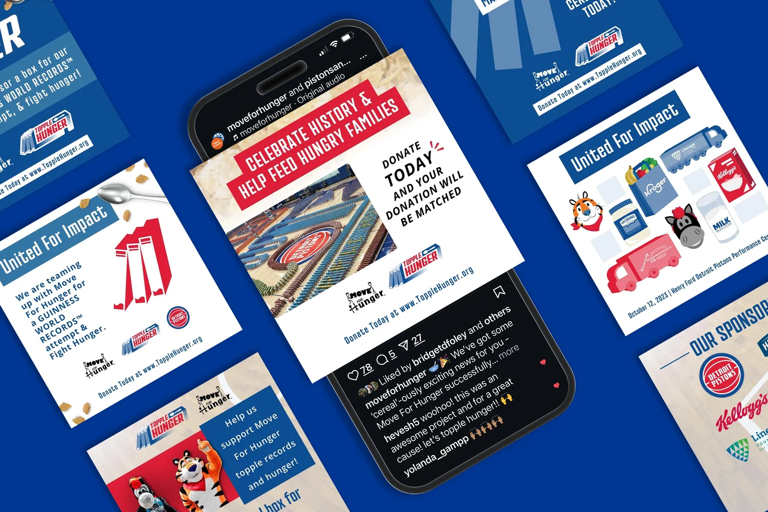
Move For Hunger
Campaign design, content strategy, paid social, and reusable systems for a national hunger-relief nonprofit.
View case study